2024-01-09
【React-Vue】重複使用的components組件
原文發表於 Medium。
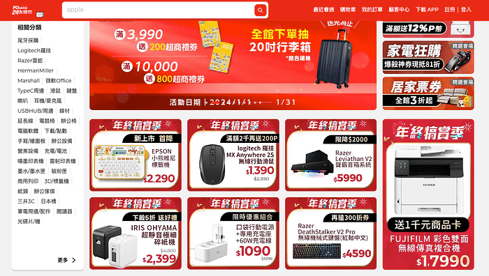
試想今天你希望某個頁面上的組件(components),有個固定套版來統一視覺感受的話(例如對話框、訊息提示欄位等),那前端框架一定可以幫到你。因為高度可重複性使用的組件,是每個前端框架都重視的事情。
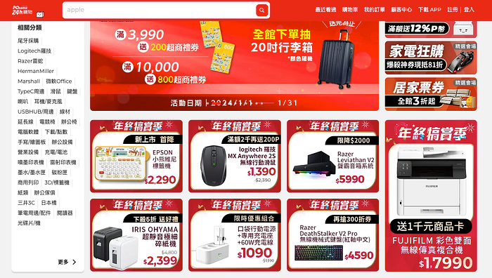
現今大多數網站上都有不斷重複出現的元素。
在React上,我們透過props本身與其中的Children屬性,把component變成wrapper,實現了靈活的套版頁面渲染。詳細內容可參照我之前的文章:【React開發中】進階版Modal-Wrapper。
那麼在Vue上是怎麼做到的呢?接下來我們就一起來研究。
template標籤與slot
有接觸過Vue的人就知道,一個Vue檔案的架構基本上是由 script、template、style這三個部分組成,其中的template是最重要的部分。在剛接觸Vue時,我以為template就像HTML上的body、head這樣的大標籤,一個檔案只能出現一次,結果卻剛好相反。只是,使用這麼多的template標籤的用意是什麼?
請仔細觀察下方的vue檔案,並請注意我標示的註解。
//src/components/TheWelcome.vue
<script setup>
import WelcomeItem from './WelcomeItem.vue'
import DocumentationIcon from './icons/IconDocumentation.vue'
import ToolingIcon from './icons/IconTooling.vue'
import EcosystemIcon from './icons/IconEcosystem.vue'
import CommunityIcon from './icons/IconCommunity.vue'
import SupportIcon from './icons/IconSupport.vue'
</script>
<template>

<!--Billy註解:第一個WelcomeItem-->
  <WelcomeItem>
    <template #icon>
      <DocumentationIcon />
    </template>
    <template #heading>Documentation</template>

    Vue’s
    <a href="https://vuejs.org/" target="_blank" rel="noopener">official documentation</a>
    provides you with all information you need to get started.
  </WelcomeItem>

<!--Billy註解:第二個WelcomeItem-->
  <WelcomeItem>
    <template #icon>
      <ToolingIcon />
    </template>
    <template #heading>Tooling</template>

    This project is served and bundled with
    <a href="https://vitejs.dev/guide/features.html" target="_blank" rel="noopener">Vite</a>. The
    recommended IDE setup is
    <a href="https://code.visualstudio.com/" target="_blank" rel="noopener">VSCode</a> +
    <a href="https://github.com/johnsoncodehk/volar" target="_blank" rel="noopener">Volar</a>. If
    you need to test your components and web pages, check out
    <a href="https://www.cypress.io/" target="_blank" rel="noopener">Cypress</a> and
    <a href="https://on.cypress.io/component" target="_blank" rel="noopener"
      >Cypress Component Testing</a
    >.

    <br />

    More instructions are available in <code>README.md</code>.
  </WelcomeItem>

<!--Billy註解:第三個WelcomeItem-->
  <WelcomeItem>
    <template #icon>
      <EcosystemIcon />
    </template>
    <template #heading>Ecosystem</template>

    Get official tools and libraries for your project:
    <a href="https://pinia.vuejs.org/" target="_blank" rel="noopener">Pinia</a>,
    <a href="https://router.vuejs.org/" target="_blank" rel="noopener">Vue Router</a>,
    <a href="https://test-utils.vuejs.org/" target="_blank" rel="noopener">Vue Test Utils</a>, and
    <a href="https://github.com/vuejs/devtools" target="_blank" rel="noopener">Vue Dev Tools</a>. If
    you need more resources, we suggest paying
    <a href="https://github.com/vuejs/awesome-vue" target="_blank" rel="noopener">Awesome Vue</a>
    a visit.
  </WelcomeItem>

<!--Billy註解:第四個WelcomeItem-->
  <WelcomeItem>
    <template #icon>
      <CommunityIcon />
    </template>
    <template #heading>Community</template>

    Got stuck? Ask your question on
    <a href="https://chat.vuejs.org" target="_blank" rel="noopener">Vue Land</a>, our official
    Discord server, or
    <a href="https://stackoverflow.com/questions/tagged/vue.js" target="_blank" rel="noopener"
      >StackOverflow</a
    >. You should also subscribe to
    <a href="https://news.vuejs.org" target="_blank" rel="noopener">our mailing list</a> and follow
    the official
    <a href="https://twitter.com/vuejs" target="_blank" rel="noopener">@vuejs</a>
    twitter account for latest news in the Vue world.
  </WelcomeItem>

<!--Billy註解:第五個WelcomeItem-->
  <WelcomeItem>
    <template #icon>
      <SupportIcon />
    </template>
    <template #heading>Support Vue</template>

    As an independent project, Vue relies on community backing for its sustainability. You can help
    us by
    <a href="https://vuejs.org/sponsor/" target="_blank" rel="noopener">becoming a sponsor</a>.
  </WelcomeItem>
</template>
上面是使用create-vue-app做出的專案中,原始存在的其中一個vue檔:TheWelcome.vue,其所負責渲染的部分是在初始頁面的右半邊。(見下圖示意)
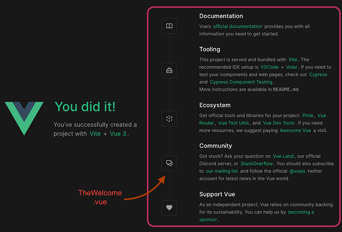
在程式碼中,我標示了五個註解,幫各位找出五個WelcomeItem組件嵌套在TheWelcome.vue中,它們就是負責這右半邊的每個橫欄。我們取出其中一段來看看:
<!--Billy註解:第一個WelcomeItem--> <WelcomeItem>
<template #icon>
<DocumentationIcon />
</template>
<template #heading>Documentation</template>
Vue’s
<a href="https://vuejs.org/" target="_blank" rel="noopener">official documentation</a>
provides you with all information you need to get started.
</WelcomeItem>
可以發現到WelcomeItem被做成有開閉Tag的Wrapper了,然後有多個template穿插其中,第一個包裹著 <DocumentationIcon />,第二個則包裹著Documentation字串,然後那些還多了莫名其妙的Attribute#heading #icon ?要了解這些額外template 的意義,還需要知道Vue的一個重要功能:slot 。
Slot:組件內部的 PlaceHolder
剛剛我們從外部觀察了作為Wrapper 的WelcomeItem 組件,現在來看看它內部長啥樣:
//WelcomeItem.vue
<template>
<div class="item">
<i>
<slot name="icon"></slot>
</i>
<div class="details">
<h3>
<slot name="heading"></slot>
</h3>
<slot></slot>
</div>
</div>
</template>
<style scoped>
//下略
可以看到在<div class= "item">中,有個用<i>tag夾起來的slot元素,slot 設定了name=”icon”(注意,這不是class喔),這是在告訴Vue:「請把父組件Wrapper中的 <template #icon> 內容塞在這裡。」我們再回過頭看一下父組件的內容:
  <!--以下對應沒有Name的<slot>-->
    Vue's
    <a href="https://vuejs.org/" target="_blank" rel="noopener">official documentation</a>
    provides you with all information you need to get started.
  <!--以上對應沒有Name的<slot>-->
  </WelcomeItem>
所以Vue在使用Wrapper時,是透過內部的<slot>跟外部的<template> 這兩個元素來將相應的內容塞到想要的位置上。在TheWelcome.vue 中那五個WelcomeItem Wrapper組件是這樣運作的。
下回在Vue檔中看到多個<template> 元素時,各位就知道那是幹嘛的了。
Bonus:寫成JSX
為了讓身為React開發者暸解Vue的<slot>跟<template>概念,我來把它改寫成React JSX的模樣:
//WelcomeItem.jsx
export default function WelcomeItem(icon, heading, children){
return(
<div class="item">
    <i>
      {icon}
    </i>
    <div class="details">
      <h3>
        {heading}
      </h3>
        {children}
    </div>
  </div>
)
}
在父組件的寫法可以是:
<WelcomeItem heading="Documentation" icon={<DocumentationIcon />}>
Vue's
<a href="https://vuejs.org/" target="_blank" rel="noopener">official documentation</a>
provides you with all information you need to get started.
</WelcomeItem>
所以,沒有給定name值的slot其實就跟React的children一樣地位。在Wrapper中的程式碼,除了用<template #name>包住的部分外,其餘全部都會被擺放在該slot處。
不知道各位的看法如何,我自己覺得…
REACT簡潔非常多(被毆
至於能不能寫多個沒有name值的slot 在同個vue裏面,答案是可以的,但它的功能就只會照搬複製一份相同的node,通常這個結果不會是你要的。
以上就跟各位介紹Vue的wrapper結構,希望大家喜歡。
至於結構簡不簡潔的評斷上,因為我從React入門,自然有一定的習慣影響。換個角度來說,對於熟悉HTML同時沒有其他框架經驗的開發者,Vue使用slot的「佔位符(placeholder)」概念可能會比較親切。
最後,我個人覺得,保持開放心態,隨時學習,截長補短,會是新時代的開發者人人必備的態度。
祝大家天天有coding,天天有成長。我是一個半路出家卻把coding當作興趣,且不斷鑽研技巧的開發者,希望有朝一日能成為全然獨當一面的技術大神。